Foreword: This is the second in a series of journals I’ll be posting about book covers, and how to make them. It is intended for the self-publishing writer with limited resources, but anyone who has any interest in creating covers can hopefully find some helpful info here.
For my part, I am a self-publishing writer, but I have the very substantial resource of being a professional artist as well. So although I have a bit of a leg up on the average writer, I am still left with creating my own covers, and my experience as an artist has given me some interesting viewpoints into the matter of cover illustration and design.
All the covers I’m using as examples come from traditionally published books I happen to have in my collection, and they are posted only for the sake of illustrating different types of covers. I have endeavored to provide all possible credit, and do not make any money from the posting of this journal. If you are the copyright holder of a cover, and feel your copyright is being infringed, please email me at goldeenogawa@gmail.com and I will remove your cover.
Making Covers: 2 — Pure Text Covers
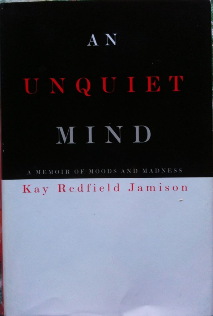
As mentioned in my previous journal, a pure text cover is one that does not have any significant artwork or decorations. All it has is text and design. Since these are the two basic staples of any cover, and since making a pure text cover requires practically no artistic skill (as opposed to design skill), I felt it would be a good place to begin.
Now, before we get started, we are going to need some software that can set type (this is different from your regular text editing software, like Microsoft Word or TextEdit). If you’re on a Mac, you can probably work with Pages. If you’re running Windows, I imagine there is a plethora of free software out there that a few minutes with Google should turn up. However, if you’re in this for the long haul and you intend to make all your covers, I highly recommend investing in a copy of Adobe Photoshop. Not only can it set type, but it will prove invaluable with creating the look and feel of your covers with its photo-editing powers. The downside is that Photoshop is ridiculously expensive, so finding a cheaper alternative at first may be a good idea. But Photoshop (or PS) is what I use, and a lot of the tips and tricks I’ll go over center around its features (though parallels may be found in other pieces of software).
So, you’ve got your software open. Time to make a cover. Most book covers are rectangles, but that’s about it; you can make them practically any aspect ratio you want. I recommend 740×460 pixels at 100 DPI for eBook covers because this will fill the screen of the tablet reader. If this is going to be a cover for a printed book, you should go and find out the dimensions of the printed cover, allow for bleed and cropping, make it at 300 DPI, and go from there. And I better make one other distinction between digital covers and print covers: print covers need a crop area. This is an area of approximately half an inch all around the edges where there is nothing important, because it might get cut off when the cover is printed. With digital covers (obviously) there is no cutting and you can have your art/designs/text go right up to the edge with no worries.
Aside from the above considerations, there is no difference between designing a cover for print and designing a cover for an eBook—with perhaps the one exception that eBook covers do better with proportionately larger text, since they are typically displayed smaller.
All that aside, let’s get to making a cover. We have our rectangle, and the simplest cover of all is just that: a white rectangle, with the book’s title and the author’s name on it. This is the basis for all pure text covers, but even in this minimalist environment there is room for almost infinite variation. I’m talking about fonts. So let’s talk about them:
Fonts are different styles of type. The one you are reading right now is probably a font called Verdana or Trebuchet MS. They are both standard Sans Serif fonts that are supported by most all web browsers, and so they’re extremely common on the internet. An example of a Serif font in common usage is Times New Roman, which you can see in the titles of these journals. There are others: Blackletter, which is the sort of font one usually associates with medieval illuminated manuscripts, the title for Robin Hood, etc. Handwriting, Script and Symbol, most of which are self explanatory. A good resource for fonts (and the study of different kinds of fonts) is the index over at linotype.com
But what category your font falls into is ultimately irrelevant: what matters is that you chose one that fits your story. So if you have a gothic fairytale you’ll probably want to look for a good Blackletter font, but you might find a Script font that you also like. It doesn’t matter; there are no rules for choosing fonts. Except one. And this is one that I made up to apply to myself, but I highly recommend you follow it as well. It will make your covers so much better. Here it is:
DON’T USE PAPYRUS.
Papyrus is not the most overused font in existence; that dubious honor probably goes to the Helvetica family. The thing about Papyrus is that not only is it a free font on all Macs, it is incredibly distinctive. Unlike Helvetica, which takes a keen eye to distinguish from many other Sans Serif fonts, Papyrus is unique… and it is used everywhere. Unaltered. Unadorned. And not just on home-printed flyers for everything from herbal supplements to weekend retreats, but plastered over the side of the spaceship Serenity from the movie of the same name (2005). This was a professional film made by professional filmmakers with tons o’ special effects and professional actors—and they didn’t even bother to get a classy font for their title.
Here’s something perhaps not many of you know: the titles for movies (and indeed a lot of books) are unique fonts that they paid a font foundry or designer to create specially for their product—so they wouldn’t look cheap. Now, there are so many fonts out there that, with a little digging, you should be able to find one that isn’t terribly overused or recognizable that fits your book perfectly well.
So don’t use Papyrus. The problem with Papyrus is not that it’s a bad font: it actually looks rather cool And therein lies its problem: a lot of people recognize that it’s a cool font, so they want to use it. And part of what makes Papyrus cool is that it’s so recognizable. So not only is it overused, anyone can see that you’ve used it. And because it’s a FREE font on all Macs, it makes you look cheap.
So don’t use Papyrus. Spend a little more time font hunting, and I guarantee you’ll come up with something just as good that hasn’t already been used by everyone from Joss Whedon to just about every health food store/restaurant in the U.S. and beyond.
All that being said. If you have a book that absolutely, perfectly and completely fits with Papyrus… then use it. Because the most important thing in designing your cover is picking a font that fits your book. And if that font is Papyrus then… well. Then that’s that.
But you should at least look at some alternatives first.
Having spent all that time telling you why not to use a font, I suppose some font recommendations should follow. Problem is the whole point of this post is to help you find fonts that are unique and not overused, and it would defeat the purpose if I just told you what to use. Besides, only you know what’s in your book, and how it will relate to the font you choose. So instead let me give you some of my favorite resources:
linotype.com is a great place to find fonts, with tons and tons and tons of every font you can possibly imagine.
blambot.com is a one-man show run by Nate Piekos, and specializes in comic and pop-culture fonts. He has a wide array of pro and free fonts—which are free to use by indie comics publishers, and I’ve been going to him for character and presentation fonts for years. If Linotype doesn’t have it, Nate probably has made it.
A note on purchasing fonts: if possible, get the OpenType format, otherwise, don’t worry too much.
And finally, look through the free fonts that came with your computer. I know I bashed Papyrus earlier for being a free font, but as I explained that is only a part of its problem. If you can find a font already on your computer that works with your story (and it it isn’t Papyrus) go ahead and use it. I know someone posted a list of the ten worst fonts you should never use (it included Papyrus and Comic Sans), but really they were all so ugly I don’t think you need to be warned away from them. Except Brush Script. I actually used Brush Script, and I think the problem with it is mis-placement more than anything else. Basically, I believe that in the right context any font (even Comic Sans) can look good. Just make sure the context is right.
So when you go to chose a font, remember that: context is key. With an illustrated cover, the context is your story and the artwork. But with a pure text cover, it’s just your story. So start with that: recognize what kind of story you have, and fit the font to it.
Moving on to design:
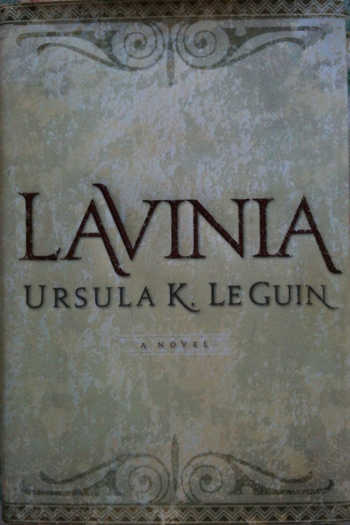
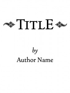
There are several different ways you can place your text on your cover. Here follows some examples. For these I have used the font Vendetta, which comes with a wide array of italics, bold, small caps, petit caps, and ornaments, to demonstrate different variations of type setting. Note that small caps and petit caps are different from all caps, as they are a separate font within the family, not just capitals from the regular version. If you want to use a capitals on your cover, I recommend finding a font with small or petit caps, or approximating them as close as you can.
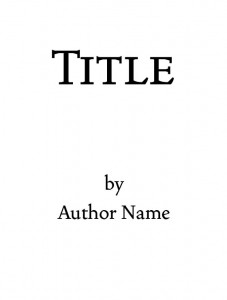 or, for the more distinguished writer:
 From here, you can start adding other bits of info, like your subtitle (if you have one), a tag-line, or other things. These can be arranged in variations on the first three forms, example:
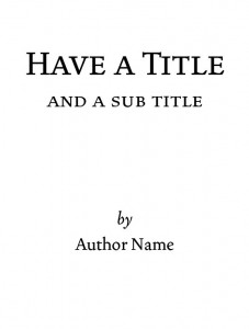 Feel free to mess around with small caps, italics and bold to put the emphasis on different parts of the cover.
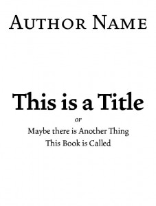
or
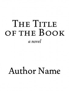
(if it is indeed a novel: I usually see this on books where apparently the designing thought that the fact that the book was novel was not self-evident.)
And so on and so on. Keep in mind you don’t have to use only one front for your cover. Two fonts work well, I find, especially when you pair up a fancy-if-hard-to-read font for the BIG TITLE and then a plain but complimentary font for the smaller text. You can also mix your sizes (and fonts) around, to put emphasis on certain words in a longer title. In the following example I used a combination of Trajan Pro and Charlemagne Std (a variation of which, I should mention, has already been used for the U.S. edition of the Harry Potter books).
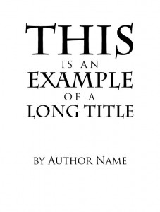
Always keep in mind the readability of your fonts. As a general rule: fancy Script or Blackletter fonts are harder to read, so keep them big. Use clean Serif or Sans Serif fonts for the little things. Also remember: white on black is harder to read than vice versa, so in general try to make the white on black words the big ones, and the dark on white words the little ones.
For the placement of fonts, it is usually a good idea to keep them symmetrical: i.e., horizontally centered on the page. If you decide to break from this, be aware of the different feel this will confer. Whatever you do, don’t make text that is supposed to be centered not. Use the Command+A “center item” function in PS, or whatever counterpart is in the software you’re using. Vertical centering is not so important; feel free to slid your titles up and down until it creates the right aesthetic feel.
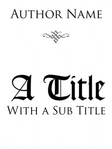
Be wary of ornaments. These are little decorative symbols that sometimes come with a pro font, and they can easily make your cover look tacky. With proper application, however, they can also add some elegant style to an otherwise blank cover:
 Combined with alternating fonts, we are coming closer to a sophisticated cover. Here I use Trajan Pro, Goudy Text MS, and Type Embellishments:
One thing you may want to consider is blocking out your cover by hand on paper, since it is easier to scribble out different versions with a pencil, I find, than push the text around in PS. This is especially useful if you have a complex idea in mind, or if you are working with a background picture.
All in all, I could go on about fonts and type setting until your ears fall off, but I think I’ve given you enough pointers to be getting on with here when it comes to type. Now, onto the background.
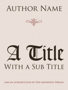
It’s a good idea to give your background some character, either through textures or blocks of color. Of ornaments on text I have already spoken, and to be honest simply choosing a nice background color with complimenting text color and tasteful application of ornaments may be all you need. Thus:
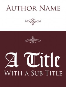
For more intrepid designers, you may consider getting a bit more arch with your contrasting colors (but be careful, these can get garish rather fast):
The important thing is to experiment and have fun. Make several versions of your cover, then pick the one you like best. Remember: no one has to see the ugly versions, so don’t be afraid to try new things.
Textures and Designs
With a little bit of creativity, you can use ornaments as background decoration. In this instance, I used the Caeldera font from Blambot.com and a figure from Type Embellishments One LET, twisted and enlarged with PS.
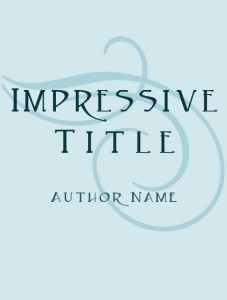
You can also, if you are PS savvy and own a decent scanner, use textures from around the house. A piece of wood or a burnt bit of paper, when put through some PS filters, can serve admirably as background texture. But this is getting close to the next level of covers: text with decoration, so I’d better stop here and save that for next time.
All these examples I’ve shown here are not particularly impressive, but they are clear, simple, functional covers. They get the message across. They may not wow your readers, but they will provide a dignified face for your book.
One thing I haven’t covered, and perhaps the most important aspect of cover design, is to make your covers evocative of their story. This is something I’m afraid I can’t help you with. But you know your story, so it’s quite easy to tell if you got it right. Ask yourself: Does this cover accurately represent the style of my writing? If it does, then you’re set.
Even if you used Papyrus.
I hope this has been helpful: although there is a lot more to pure text covers, I think this enough for you to get started on. Remember: it is okay to experiment, and always try to match the feel of your cover with the feel of your book.
Next time I’ll be going over how you can incorporate bits of artwork and background imagery into your cover. I hope this has been informative and helpful, but if you have any comments or questions you can email me at goldeenogawa@gmail.com, or tweet me your response in a blog entry @GrimbyTweets.

